Monday, 7 October 2013

Using colour personally.


 Having already conducted analysis into the way that particular artists in the eighteenth century used colour, as well as producing a chronological chart of the evolution of colour theory, we wanted to expand our knowledge and perception through some practical exercises. We have been hammered with the generic meaning and feeling behind colours but in this exercise we were told that once we were finished we should write our own personal perceptions and ideas behind specific colours, the activity was also a chance for us to work on our general painting skills as being able to create tones and smooth lines can be very useful at times.


 A close up of part of my painting, the colours that I chose to go next to one another were completely spontaneous however upon creating I realised yellow and purple are complimentary to one-another, which helped the painting look visually pleasing.


 I wanted to achieve consistent strips or bands of colour, that when placed next to one another will look like a smooth, gradual change from vivid, to smooth, I didn't struggle to achieve the look I wanted however I did have some trouble going from really dark to simply dark without overdoing the white- I do feel I was successful though.


The final outcome; I felt I was successful in showing the multitude of tones that each original pigment has, whilst I missed out about 50,000 possible colours, I did include some obvious changes, which is what's important.  I also commented on the personal relevance each colour has to me, and me alone. One example of the way I alone perceive colour is that kaki green reminds me of winter, this is because last winter I bought a massive trench coat which was kaki colour- we also did some colour association exercises, where we imaged the specific colour that certain idioms would represent, like,'flying' colours. 

Monday, 30 September 2013

Kandinsky


 Wassily Kandinsky, born 1866 in Moscow was an influential Russian painter and art theorist, he is often credited with creating the
first truly abstract paintings. He died in Neuilly-sur-Seine, a French suburb of Paris in 1944. Kandinsky's abstract pieces interest me immensely, I am fascinated by the forms he creates and the spontaneous and impulsive nature of a number of his later paintings(emphasis on later as a lot of his early work was fascinating but not as abstract or analysis worthy for me personally). It is due to this that I have chosen Kandinsky's 'On White (II)' to analyse, this piece was created in 1923. The piece is situated in Paris, in the 'Musee National Art Moderne, Centre Georges Pompidou', I found out about this piece when I was researching famous artists who pioneered abstraction in painting. This piece was one of the most frequently occurring however I did find joy in looking at it so it seemed appropriate. 

 
 If I had to describe this piece using five words I would use; abstract, mathematical, calculated, geometrical and lateral. If I was describing this work to someone who could not see it, I would say it is a work of colliding geometrical forms and shapes of varying intensity and colour, all seem to be exploding outward a towards the edge of a white canvas. At first I only noticed the more apparent shapes, however upon closer inspection I am able to notice the more intricut details . These details include; the square grids of different colours and tones and the smaller lines and swirls.


 The work is oil on canvas, the most interesting feeling from the work is definitely the density and sharpness of it. The bold look is so pleasing to my eye.

 Kandinsky had Synesthesia, a neurological condition due to a miss-wiring in the brain. This can cause 'sufferers' to experience misaligned sensory reactions. One example, listening to a song, and seeing colours and shapes form infront of you, as that miss-wiring causes your brain to perceive it in that way. This was infact the main inspiration for a lot of Kandinsky's later work, he is noted for saying, 'music is the ultimate teacher' and 'lend your ears to music, open your eyes to painting, and stop thinking' the second quotes implies the visual connection between music and art that Kandinksy had, he was trying to create a symphony in all his pieces, visual-audio experiences in one. Music and sound were Kandinsky's main inspirations, I believe this as he also stated that the majority of his work was, 'improvised' . The work and approach of Kandinsky  is immensely related to my project; he recites his audio memories in his paintings, perhaps I could try and project my own experiences of sound through art? My holiday did have a few significant moments involving sound, one I mentioned previously which was seeing the Rolling Stones live in Hyde Park.

 If I had to give a new title to this work, which I would gladly, considering, On White (II) isn't overly exciting; I would call it, 'Formal Explosion'- a play on words,
Form, for the shapes and, well, forms that are present, explosion due to the outward travelling nature of piece, however the forms are very graphic and straight, very formal. The title is actually very influential on the viewers interpretation of the piece. A title is in a lot of cases, the only written information you're going to get on a piece. It is because of this that I think a title is one of the most crucial parts of a piece. Not every title has to be something charming, poetic or eloquent, but have meaning, on white (II) I think is used as a metaphor, people often talk of a blank or white canvas, something fresh and full of possibilities, perhaps Kandinsky wanting people to form their own interpretation when naming it? The work feels like a void or cortex, something that would suck you in then spit you out. This is due to the density of forms and objects in the centre, in comparison to the sparse wastelands of the outer canvas. This work reminds me of, a stage design by British artist David Hockney. David Hockney also,'suffers' from synesthesia, and when he is designing stages he listens to the music that is going to be in the production and his mind does the rest, creating fascinating images and forms, 'the tree just starts painting itself' apparently. 


 The technique, or inspiration for these two works is what draws them together, aswell as the meaning, they're both strongly related to the relationship that visual art and music have and how one can be represented through the other. The contents of the paintings are both inspired by the visual experience that they have when they listen to music, these links, actually make their work very similar. 

 I like the experienced use of colour in this painting, the composition is perfect for the eye aswell. Nothing seems out of place. I honestly can't think of anything particularly wrong with this painting. Curious to see what other thought of him, I searched for scholarly reviews, this is one quote that particularly stood out for me,'Wassily Kandinsky was one of the most original and influential artists of the twentieth-century' I feel they may have this as he is often descibed as being the father of abstraction, a pioneer in the acceptance of abstract work in the art world and one of the first people to attempt such work on a professional level. His work is consistently impressive in its originality, as well as the dynamic compositions. 

 I'd like to create a thoughtful response to Kandisnky in acrylic, acrylic is always my paint preference, I like the low maintence of it, (no mixing medium, quick dry time). I spent a lot of my time in the summer around music, i'd like to try and remember the music I was listening to/heard and using logos or musical symbols associated with that act, create a paint response to them, (I.e. painting the famous lips for The Rolling Stones) in a timeline format! Different music for differet periods of the summer! Fortunately any music that did really resonate with me is noted in my journal. This painting links to my project of memories as I'm creating a visual-audio account of my summer using paint, I unfortunately don't have synesthesia- so I have had to adapt my work according to what I do have, an accurate collection of the time and place that I heard certain songs!

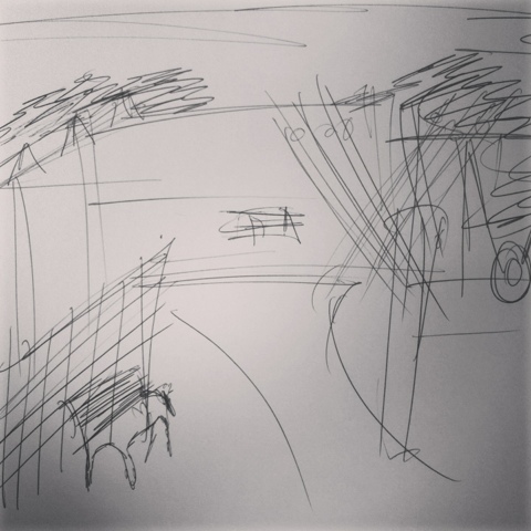
 I sketched out the general idea that I had, upon sketching I realised that instead of trying to mix memories into once piece, to avoid unnecessary complexity- I would create a single piece dedicated to some of my more profound memories of the summer, but still memories cantered around music- I started off with the most obvious seeing the stones, I thought of what made that day special, what colours stood out to me? What I did? I created a sketch of my plan, which in itself was quite successful, if I might say myself! 


 I approved of what I had created and embarked on my piece, I wanted it to look spontaneous and rushed in places, and graphic and thorough in others, I also wanted to include other activities that were involved in that specific day, (this day was the same day that I partook in a painting competition, very significant)

 This piece proved to be a massive challenge for me, it was very out of my comfort zone, tbs difficulty in producing something meaningful and powerful yet abstract is a skill which although I improved in this activity, definitely needs further refining. I like the relevance of everything in the photo, and that it is abstract yet decipherable, I wanted people to feel visually excited yet informed about my memory, hence the iconic symbols and sketches. Watercolour pen seemed to work better for this activity than what the previously planned, acrylic would have. It spread much easier, allowing much more precision and creating vivid colours. I do however feel I could push my ideas further by doing a few more of these based on different memories, using different mediums, (now that I finally have some acrylic paper)!!!


Sunday, 29 September 2013

Using our memories!

 As mentioned previously, the summer gave a nice window of time to go out, have fun and then look back on the times longingly as we pack our bags the night before- fortunately I returned to some exciting stuff involving what I had collected over the summer- the journal and the box both had a role and will continue to have a roll throughout the project. Firstly the box, we videod ourselves explaining the meaning to some of the more important items in the box, how they link to artists we have already explored (particularly Warhol) and where the could possibly take us in our project, I was very particular about which items I chose to discuss as I have already thought about which ones could have more potential outcomes and exciting properties than others.


 We then wanted to do a more practical exercise involving our work from the boxes. We 'unboxed' them and set them out onto a table in a way similar to a still life.


 I was not overly impressed with the way my items looked when laid out, I had experimented with various compositions and this was probably the best formation I could create. Having realised that my items aren't particularly exciting looking from such a camera angle I wanted to experiment with that as well, I decided to take a few more pictures from angles which made my items look more dynamic. 


 From these angles I found a much more refreshing view of my items, I was able to appreciate them for their photographic potential and wanted to work on this further. I was fiddling around with focus and perspective trying to find the ultimate composition and angle was no easy task.
Eventually I came to a conclusion about a photograph, boom- that was sent off, printed and put on a light board. We then traced it with fine liner and the results from that alone were quite interesting let alone what we planned next.


Having fully traced it with fine liner the possibility of a hyper-realist photograph were looking plausible, we decided upon it and got painting right away....

Started blocking out and adding slight details/tones

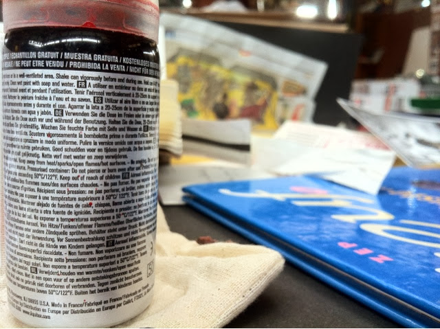
I was finding the idea of a hyper realistic piece even with the trace a difficult task to achieve in paint as I had a lot of small
text in my photo which was very difficult to paint regardless of the size of the brush, the details were simply too intricuit. I used a fine liner to capture some of the more fine details, (including objects in the photo, which are drawings in fine-liner) 


The finer liner along side the acrylic helped achieve an acceptable level of accuracy on my behalf.

I had difficulty with the sudden change in tones of the spray can when I was blocking out so I just decided to try and paint it there and then. 


 By which point the prospect of photo-realism was looking unlikely however the idea of representing my holiday, my summer, in an almost narrative way reminded me of a very ronowned artist who works in a similar way. 

 Audrey Flack, pioneer to photo-realism and a main inspiration for this work, her idea of creating a visual embodiment of a specific period in her life within a painting was very similar to what we were trying to achieve. They were similar in the varying degrees of objects and meanings as well, from fruit, to candles and photographs, flack makes no massive or obvious effort to only include things which would be obvious symbols, but instead bases her judgement on her personal experience involving certain objects, and we tried to approach that the same way, looking at something symbolically, rather than physically allowing my objects to range from glow in the dark tatoos, to notes from my mum about how much trouble I'm in! 


               One of Flacks creations;


 I have noticed however, a difference in the painting angle that Flack and I have approached this. Browsing through her work I can see a recurring pattern of this aerial view angle, which is probably very useful in being able to capture everything she wants without unnecessary levels or complexity as well as being successfully able to record a narrative story. I on the other hand found myself (as mentioned previously) quite unamused by my objects from above therefore started experimenting with various angles until I could find one which would do my objects some justice.

Wednesday, 25 September 2013

The evolution of colour theory!

             THE EVOLUTION OF COLOUR THEORY;

 The theory of colours itself and its physical properties have been the subject of vigorous investigation over the last four centuries, people always, and I mean always displayed a fascination for colour and it plays a fundamental role in virtually every society in the world. Infact they can trace colour and it's uses back to early man, scientists believe the innate attraction that boys have for blue and girls for pink stems from different roles early men and women had, colour has always had a role in one shape or form. I'd like to chronologically present how the understanding of colour and it's physical properties has developed over time.There have obviously been discoveries of varying controversy, excellence and impact however they have all actively contributed to the understanding that we share today, and the journey is far from over yet as we develop newer and more complex technology we can continue to dig deeper into the messy and hectic world of colour!

   
               THE 18TH/19TH CENTURY

In 1704, Sir Isaac Newton published a book called Optiks, which essentially stated that the previous thought from Artistole and Theophratsus was false,they believed that 'pure' light, (light from the sun) was simply white and not visible to the eye and was only distorted when it was manipulated by another medium like water.Newton however claimed that light is made up from different spectral hues, infact seven, red, orange, yellow, green, blue, indigo and violet and all colours, even white are to be made from a specific combination of these colours, (white was thought of as a colour at the time).He also stated that colour is a sensation in the mind and colour simply derives from the physical properties of light. When light is refracted at a given angle, it will project a different colour,the colour is whatever wavelength is produced when the light is refracted at this specific angle. E.G Red has the lowest energy and frequency, but a long wavelength. This discovery changed the dynamics of colour theory as we know it, from the hues of light and the scientific properties of them, Newton was able to determine which colours were complimentary to one another- essentially, which colours would look the greatest if they were to be placed against one another, this was as follows, RED:GREEN YELLOW:PURPLE BLUE:ORANGE - this discovery rocked both the art and science world (as interlinked as they are!) and changed the approach people had to colour, moreover creation of things completely!


    BASIC COLOUR WHEEL 
      DEVISED BY NEWTON


In 1810; German poet and government minister, Johan Wolfgang von Goethe published a book called,'The theory of colours'. This book claimed that colours that compliment one another exist and equally opposing colours exist and the book documents the investigation of afterimages, in contrasting shadows of light.


In 1839;

Michel Eugène Chevreul a French chemist, who had become the head of a company manufacturing dye, along with other things, stated that colours placed near one-another that are complimentary to one another appear different, or have a strange hue, for example to place a yellow cloth onto a blue table, would give an orange hue, as orange is complimentary to blue. This eventually evolved into an entire theory on colour contrast. Here are two examples.

Successive contrast; stare at the dots in one of the circles in the top section for thirty seconds, afterwards look straight at one of the dots in the circles in the lower sections and the colours will appear different even though they're the same.


Simultaneous contrast; observe both grey blocks in the centre, the top one looks brighter than the lower one, however this is just due to the darker background that it happens to be one, infant they're the exact same colour. 


         SYNATHESIS;

Not necessarily related to colour theory but colour itself, the neurological disorder synathecsia; don't be fooled- this is no disorder.
Synathecsia allows people to experience multiple sensory stimulation, for one given occurrence, one example being David Hockney, when designing a stage, he listens to the song that's going to be in the performance, when listening to that song his brain produces images and colours, this will be the inspiration for his stage design. It isn't always Music ----> Colour, sometimes people can experience the reverse, some people have even reported hearing different songs when looking at different buildings. Synathecsia affected a number of artists in the 18th century and onwards- it wasn't known as anything back then, however some 'sufferers' have coined it as,'hypersensiti' which is very understandable. 

 One noteable 'sufferer
' was Kandinsky- who was able to 'hear' colours, he is widely credited with creating the worlds first truly 'abstract'
paintings, remember abstract isn't simply, 'made up', but more a slightly more poetic and lateral way of representing something, with inspiration and idea rooted in truth and discovery. 
Kandisky aimed to create the worlds first visual symphony, paintings that are audial, and visual, this explains the wild levels of energy, colour and space that he used in his paintings- he could more accurately place what felt right due to his multi-sensory feelings towards his pieces.
This 'disease' was clearly advantageous for him, he created his largest piece, (Composition VII) in three days, while art is not a race, usually if something of that scale is done at such a speed, it won't visually (or audibly in his case) deliver however this piece is a notable exception. 


This 'disease' pushed forward the relevance and meaning of colour to a new level. Normal people weren't necessarily able to hear sounds, but they upon seeing other people's work were able to make the connection, a number of artists started using colour not just to represent what was there but to give a more sensory experience. Colour began to have an even larger 
impact on the way we can perceive things.


20th Century- Present day understanding;

Carrying on from Goethe's work, German and English scientists determined that light mixing in the eye is different from mixing of dyes.established in the late 19th century that color perception is best described in terms of a different set of primary colors – red, green and blue (RGB) modeled through the additive, rather than subtractive, mixture of three monochromatic lights, also known as spectral colors.

In translation- mixtures of different waves of light doesn't have the same physical mixing properties as pigments so the same principal can't be applied to both.


Wednesday, 11 September 2013

Collection of items!

Throughout the summer I had to collect and document as much of my activity as possible so when I return to class, I have a significant body of evidence to gather inspiration from. At first I found this task tedious and resisted it a bit, but as I found myself doing it, I realised the vast scale of grand things that I have done that exist only in memory, and whilst I still have those memories, something personal yet shareable, not to mention physical, would have been a lot better- doing this also actively encouraged me to go out and have loads of fun and be really irresponsible and travel far! It made the idea of going out and then eventually having to go home not as miserable as I'd know I'd return to documentation of the day which was always thrilling.

I started off where most artists would, with sketches of where I visited, whenever I see these, I remember the exact time and place, which must mean they're very powerful


View from power box on Putney High Str.


        Need I explain where this is?


  My room before it underwent changes.


Discreet section of Wimbledon Common.

 The sketches were an opportunity for me to remind myself of a enjoyable memory in a very specific moment, when I reflect on memories, I'm always aware of the place however I could never specifically say where they were just give a general description, on the other with these sketches; not only do the sketches depict accurately where I was, but my actual raw memories from doing them has aligned them to a very accurate place in time and space within my mind which I'm finding to be increasingly helpful. 

 Visual responses were also very helpful but what would be equally as helpful is an actual physical collection of materials and resources- I needed to collect stuff to respond to, you can't sketch absolutely everything, well you can but when you're in a restaurant you're there to eat, not draw, so it doesn't always prove practical, whereas a leaflet, or a menu is a direct indication to anyone rummaging through your items that you went to that specific place, accopanied by a receipt and you have yourself two things which depict exactly where you went, what you brought, and when you did it. The box also proved itself as a practical solution to sketching with respect to the size of these items, I couldn't physically record a book in my journal, responding would seem odd, instead I simply placed it in the box and receited the significance of it in class, simple.


 In between sketching and some cumbersome box, I wanted to create something more compact, yet, three-dimensional, physical and presentable, a journal. The journal would admittedly prove to be my most enjoyable yet time-consuming of the three, we put so much emphasis in this world on 'capturing' a moment yet people seem to think that capturing is limited to photos, anywhere I'd visit, I'd keep tickets, flyers, sweet wrappers, receipts and photos..(yes but they're amongst a host of other things!) 
and create a piece out of them themselves, arranging them in exciting positions followed by writing and a quirky response and I had myself a book I could say I was very proud of! One of my most memorable days in the summer, seeing the Rolling Stones 'live' by climbing to a ridiculous height in a tree in Hyde Park, was all documented, hanging on with one hand and taking photos with the other, this was an example of the standard of pages that I was creating.


Due to my 'success' at collecting in various different ways over the summer I now have a substantial body of work to gather inspiration and ideas from, as you can see from my journal my days out were already producing some work so getting started and excited by this shouldn't be too difficult. Memories is such a broad topic, (within reason) which allows for me to respond to a seemingly endless number of things and events, which is also very promising! 


Friday, 28 June 2013

Art Trip, collection of primary sources.

Having looked at the fundamental reason and meaning behind Hodgkins work, we decided that we should embark on our own trip at that immediate moment. As we know, Hodgkins works on the basis that what he creates visually, is stimulated by various senses and feelings that are evoked at that specific moment, based on this we went to the park and collected objects which reminded us of the park or were symbolic of the park, we also did some videoing/photography to more accurately capture some elements, I.e sound, which we wouldn't normally be able to capture or have difficulty in doing so.

This photo proved to be particularly exciting as we, as the visitors to the park, are very contrasting to the natural landscape to which we are in, with our dark synthetic colours in comparison with the fresh greens, and pale browns of the landscape, this makes this picture very visual and thought provoking. I wanted to create my own work with my own distinctive style however basing the approach to my work around Hodgkin, due to this, I managed to create an acrylic painting depicting us in the 
landscape, I really tried to emphasise our contrasting presence within this painting


When I was painting this, as previously mentioned, I noted the contrast between us and the natural environment, particularly the red hair. Upon finishing however I noticed the consitancy of natural earthy, yellow greens, browns of different shades and pale blues, I wanted to capture these with a more expressionist and relatable style to Hodgkin. I captured the main colours I saw which evoked a natural, fresh feeling. However I also included the synthetic red as my eye was drawn to that aswell.


The observations that I did at that very moment are obviously very sketchy and rough, however applying my own unique flare and approach to the setting allowed me to once again emphasise our presence and show how vivid my memories of the park is, through colour.


This other sketch is one of the newly built park- very exciting one may I add however due to nature of how new it is, it doesn't hold any memories in particular for me. I represented this through a monotone sketch in pen which took literally 30 seconds.


Wednesday, 5 June 2013

Andy Warhol


                        INTRODUCTION


 Andy Warhol  was an American artist who was a leading figure in the visual art movement known as pop art. His works explore the relationship between artistic expression, celebrity culture and advertisement that flourished by the 1960s. After a successful career as a commercial illustrator, Warhol became a renowned and sometimes controversial artist. His work is among some of the most expensive pieces ever to be sold in the art world.

-----------------------------------------------------------------
      

                        FIRST IMPRESSIONS 


 For me, Warhol is an acquired taste, at first I found his work very fickle, unimaginative and unoriginal, then it dawned on me that he was the original, the first one that created these prints and learnt to appreciate the cultural impact he had, however, some more interesting, less publicized work of his recently was the subject of a lot more interest for me, his time capsules. 


-----------------------------------------------------------------
       
                         TIME CAPSULES

Over the course of thirteen years, (1974-1987) after relocating his studio to New York, he collected an extensive variety and almost obsessive levels of bric-a-brac. Upon discovering the efficiency and effectiveness of storing 'stuff' (as so coined by him) in boxes, he decided to continue to collect this, 'stuff', the result? six-hundred and twelve filled boxes giving insight into a number of things, including, what Andy was up to, what was happening at that very moment etc. Warhol always prided himself on being a cultural 'mirror' and reflecting the happenings of the times, this only added to it and created an even larger legacy for him. I find these particularly interesting also due to the diversity of the 'stuff' collected, from newspapers and flyers, to books and cards, all of these personal to a specific moment and time thus immortalising that time, forever.

-----------------------------------------------------------------

                    WHERE CAN THIS TAKE ME? 
                          
 I'd like to create my own memory box over the summer, i'm aware it can't be on the same scale as Warhol however I want to document my activity in as many ways as possible, with evident Warhol influences whilst retaining my own artistic, 'stamp'. Whether it's a visual response, an object which was present or simply a journal, I want to aim to create a large body of work which will ultimately be able to evoke some fantastic and unique summer time memories, each completely personal and requiring some explanation. Having my own items and memories to work from would provide me with a consistent and diverse selection of ideas and sources for inspiration. I am looking forward to collecting in any way possible and getting strange looks from people as I stuff leaflets in my pockets!


 Summer has ended and I have been extremely busy collecting! What a summer it was, I don't think I can ever run out of inspiration for this project; similar to Warhol, we collected a box- everything that was too big to document in a journal, was crammed, and I mean crammed, into this box, flyers, sketches, tattoo boxes, spray cans, comics, the list is endless. 


 The box was most effective due to the space, I could store almost anything and everything in here, which in turn will allow my responses to cover a wide range of topics! 
-----------------------------------------------------------------

                           APPENDIX

http://edu.warhol.org/app_aw_tc.html

http://en.wikipedia.org/wiki/Andy_Warhol

'A Dictionary of ART & ARTISITS'


Monday, 3 June 2013

Hodgkin

Howard Hodgkin is a British Painter and printmaker, his work is often associated with abstraction and has poetic connotations.

My first impressions of Hodkins is that he is a very poetic, eloquent and thoughtful artist  he appreciates that a message or memory doesn't necessarily have to be depicted in something you would call realistic or accurate but in a conceptual and perceptive manner. It's also quite a brave and courageous move to create work which is guaranteed to be lost on some people. I had to study his work to appreciate the greatness of it.                                       Although Hodgkin's started his career with hard-edged pieces on canvas and board, he now does more sweeping, spontaneous and multi-tonal/coloured forms, whilst still retaining the fundamental meaning behind his work, which is to try an convey a memory as suppose to something he saw, there is a slight difference. A famous quote by Hodgkin's,'When I finish a painting, it usually looks as surprising to me as it does to everyone else' which shows just how spontaneous yet meaningful his work is.

------------------------------------------------------------------------------------------------------------

The artwork reminds me of futurism, although I know the majority of his work isn't centered around motion. His work relates to abstraction, the idea that visual elements in a painting don't necessarily have to be achievable in real life. His work reminds me of Kandinski a little bit however his work is perhaps even harder to decipher, if it should be. I'd like to ask the artist if memories were the only inspiration for his pieces. Perhaps I'm sure how he'd derive such variation from simply memories, even if memories can be varied. Through his work, instead of aiming to create a memory, I want to buy a disposable camera,trace the fundamental shapes, and block it out in vivid colours, to capture the memory, whilst creating a painting in it's own right.


This was my own personal analysis of his work, made on Powerpoint.


 I feel the piece has very effective use of colour, it's very vivid and powerful. It's very pleasing to look at. I don't think the message  that Hodgkin is trying to convey is very clear, I can appreciate that his work is abstract but equally he says he is trying to create a painterly interpretation of what he saw and what events transpired that night, if the piece was not called 'Dinner at West Hill' I would have never been able to make any interpretations of food or location based on the forms in his painting. Hodgkin stated that this painting was the most 'complicated and delicately balanced painting' that he ever allowed himself, when explaining the meaning for the forms he stated,'most of the forms in the painting which are not part of my normal language derive of course from Bernard's pictures. In some cases these even overlap (his and my forms)' also 'the white line is the picture plane, the edge of the table, also it cuts the picture in two and shows therefore in two ways that everything is flat—the illusionism isn't a lie after all.’ These two statements from the creator of the painting himself proved particularly interesting to me as I managed to align and compare my personal analysis of his work with what he actually intended to create. I wanted to get an outside opinion so I asked my piers, one of them stated that, 'they don't feel anything towards or from this piece'
when asked why she said that it didn't display anything of any tenuous enough of a link to reality to be understood or felt.
The white line through the middle of the piece makes it very distinctive and easily remembered. 

 My response to Hodgkin based on my experience in Tooting Bec Common.