The first object I used for my inspiration was a flyer for a small festival that I attended in Kent over the summer, I had been before and found the small size and friendly atmosphere very refreshing in comparison to London however this time in the summer some questionable characters were going that I was convinced weren't going to appreciate the ethos of the festival and not get 'into it'. To my surprise, they really embraced it and everyone thought they were really nice, including me! The shades of blue and red either side represent the two completely different sides of the spectrum that came together, the white line that's flying out represents the neutral relationship we had and the lack of hostility towards one another.

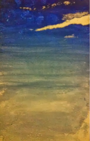
The next painting I did was one based on a French comin my friend brought back for me, the object itself isn't that vivid in terms of memory however the day that I got it is. It was a clear day and the sky was every shade of blue, with one cloud, only one visible in the entire sky. It was such a chilled day that I can recall very easily. The use of blue is not only to represent the physical sky but to emphasise the tranquility and magnitude of the sky, being of an outstanding size (volume if you want to be scientific)
The next painting I did was based on my most powerful urban exploration, not only being my most ambitious and elaborate exploration to date, but also the one where I got in the most trouble, the physical object of my inspiration being a note from my mum detailing my punishment when I got in at 4AM.
I used dark green with spots of light red and light green, the dark green was the areas of parks that were barely illuminated, the red was the sense of danger as my mum was sending me texts explaining just how much trouble I'm in!

My next creation was based on my swim in Tooting Bec Lido, I got the brush and bent it back then released to create splash marks, to symbolise the water, the green is to represent the natural feeling after going swimming in the lido- outdoor pool, sun is out, warm and cold, I felt great. The blue next to the pink was used as a contrast tool to represent how powerful the colours felt, particularly when I was swimming. Everything was so bright, but naturally bright.

My final piece was based on a leaflet for Spitafields market that I went to in the summer- the converging lines are to try and simulate the experience of looking down the market stalls, rows and rows of show keepers, the variety of colours on one side is for the bric-a-brac which I personally found more interesting, the purple side was a section dedicated to flowers and decorative ornaments.

These paintings gave me a unique opportunity as an artist to develop my ideas about colour and conceptual understanding of colour at the same time. By doing these paintings and forcing myself to not depict what I remember accurately, every inch of colour theory I had learnt was tested and stretched. Abstraction was a process that I was, and continue to be very unfimilar with, it is however refreshingly uncomfortable and challenging - it is only by doing this and making very discriminative choices about the colours I used, the size of my piece, the material of the piece, ( a lot of these were created on Saunders paper, others cartrdige paper for specific reasons) and the mediums I worked with,was I able to create five meaningful and creative pieces which were a physical embodiment of everything I have learnt about colour theory. This task also proved to be particularly helpful in narrowing my focus and discovering my artistic interest, through this activity I have learnt to appreciate the work of Hodgkin even more and the raw difficulty of producing work related to memories just using colours and basic forms, I very much enjoyed this expressive approach and want to continue to explore Hodgkins techniques in my future work, refining them to an extent that I'd be able to use Hogkin in some way in my final window installation.
Again, how could this technique be used in your final outcome? Could this technique emphasise the meaning you are trying to convey? ;)
ReplyDeleteI like your responses they look bright and clear, I know I'm being a hypocrite ;P but check your spelling! <3
ReplyDelete